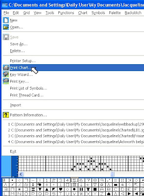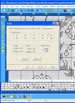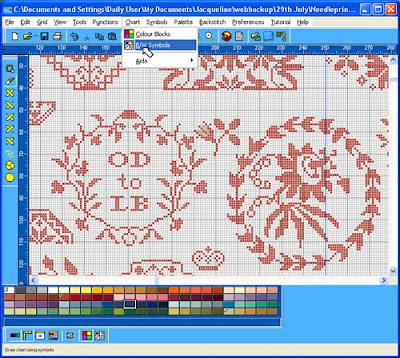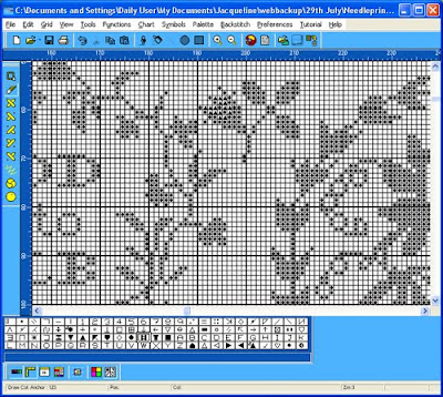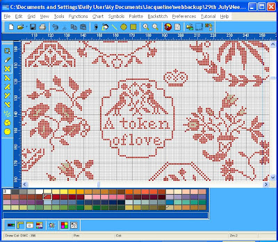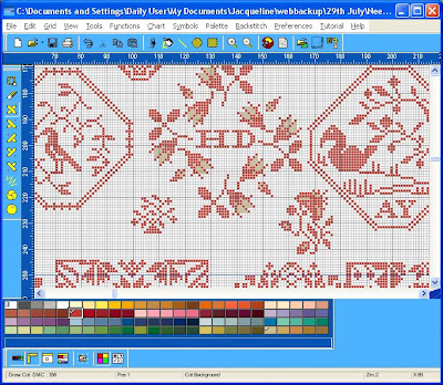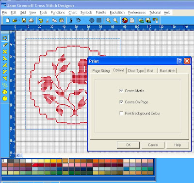
It is good to have some pictures again to help explain what we are trying to do. The first thing you can see here is that I have copied a motif from the Beatrix Potter sampler and pasted it into a new file. So it takes up very little space in my work area. Before going on to print it, I have picked the Lasso Tool from the right Tool Bar and have used it to bound the area I want to print. And it is precisely these blocks which will appear on the print-out. The question is, how will they appear? Just to refresh, to get to this Print Option block, I have selected File from the top left of the Top Tool Bar and run down the menu to choose Print. The uppermost tab on the block is the Page Sizing Tab which we have already explored. And so I have moved on and selected the next tab in the Print block - Options. Here I can opt whether or not to show Centre Marks. I think they are very useful and so have decided to print them. These appear on the outside border of the chart as 4 triangles pointing to the centre of the chart. I have also opted to centre the chart on the page - it is always easy on the working eye to have a pleasing, symmetrical arrangment on the page. If you do not choose this option, your chart will be positioned at the top left of the printed page.
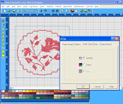
Let's move on to the next tab, now, Chart Type. I am printing this chart on my Laserjet printer so I have chosen to print black and white symbols - and I can do this even though my chart is still being displayed in colour. The Aida option will give you a background which simulates Aida Fabric which may be of interest to you.
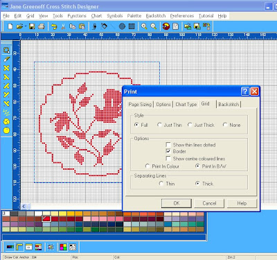
And we'll move along again to the next tab - Grid. I have chosen the Full Monty - to print both thin and thick grid lines. I could have chosen just the thin lines in which case the periodic thick lines so easy for counting off stitches would not appear, but maybe if you are printing a small excerpt they might not be necessary or aesthetic. The Just Thick lines is an interesting option which shows just the periodic markers with no grid lines in between. If someone can think up a use for this option they might like to share it. And the last option is no lines at all. Which you might like to use in combination with the colour Chart Type option to give people a quick impression of how your finished sampler will look when stitched, if you are not able to produce a stiched model for this purpose. Moving down a little - Show Thin Lines Dotted - you have to be joking....or have I missed something here? Show Border? It gives a pleasing edge to your chart. Show Centre Colour Lines is a very useful option when printing in colour. Because I have opted to print black and white symbols on the Chart Type, I choose Print in B/W here. And finally, the last row, Separating Lines Thin - only if you have eagle eyes, choose Thick if you prefer an easy life.
I won't go into the final tab now which relates to how Backstitch is printed, but we shall look at some Blackwork in a later lesson when all will be explained. Tomorrow we'll look at how you can export your chart.
in addition to reducing our carbon foot print by 30%. This is how we thought of INFINITY CHARTS. These are charts in PDF format and EDITABLE format for you to download with no postage or guilty air miles. Even better, you can download charts ready to recompose, recolour and change initials (or whatever your heart designs!) in Jane Greenoff's PC Cross Stitch Designer or MacStitch Charting Software. You become the Designer. Infinity Library Motifs are Copyright Free. If you don't have Jane Greenoff's Cross Stitch Designer Software you can buy it now. It comes bundled with editable versions of the Beatrix Potter and Mary Wigham Quaker charts for $20, $14, £10, 2000 Yen.
Tuesday 5 October 2010
Sunday 3 October 2010
Making Your Chart Smaller
The grid available for charting is very generous indeed and you might feel swamped or lost if you are only making a small chart. So how do you cut your working grid down to size?
The answer is very simple. You can't.
But what you can do is to zoom in - look for the zoom magnifying glass on the top tool bar to get in closer to your chart.
If your problem is that you have trouble locating your small chart in the vast expanse of grid - then work up in the top of the grid space - or use that nifty tool, the locator window which we explored in an earlier post, to help you zoom into your work area quickly. You can keep your locator window parked down by the palette for ease of access - but if you want to move it, you must click on one of the thin white narrow edges. If that is hard for you just click View on the top toll bar and check Locator Window to dismiss it. The you can bring it back any time you choose by selecting it again and it will be in the middle of you graph.
If you are concerned that you will have reams of paper printed out that will be blank, please don't be concerned, the software will only print your active area. However, because I know it easy to drop a stitch accidentally way off chart which will generate a bigger print area, I usually define the print area by using the lasso tool. This also allows you to have more control over the size border you print around your chart.
Luned will tell us the Latin for Make a Virtue of Necessity or we shall send her back around the hockey pitch......or maybe she will send us back around the hockey pitch - I know the answer is there somewhere.
Wednesday 29 September 2010
Fifteen Times Round the Hockey Pitch!
I do apologise, I am working away from home and don't have the Jane Greenoff software loaded on my laptop, so I can't show you what I wanted to tonight. However, before you throw your jolly old Panama hats up into the jolly old air, this is not a declaration of holiday. Oh no. You know those streaming, wet days at school, when you thought you would be let off churning up a boggy hockey pitch and could pull out a novel in the library to read in peace in quiet....what happened, then? It was 15 times round the hockey pitch, start sprinting now, while the games mistress looked admiringly at your mud splashed, livid chapped knees from under the cover of the games pavilion while sipping from a flask of hot cocoa, wasn't it? Exactly. But it is all for your own good, believe me. And what you can do tonight is just one whole barrel of fun and when you are through you will be thinking, that was jolly character forming, thank you, Jacqueline.
Last night we looked at printing your chart and if you return to those first instructions you will see a little further up the menu the option to print the list of Symbols. OK, so do that. Now you have that printed out, go through all the symbols and just black out all the nasties, symbols you wouldn't like inflicted on you, if you were working from a chart. Now you have an easy-to-find working set. Save this list somewhere safe, but before you do, have a spring clean of your symbol palette and you will save yourself literally hours of frustration and toing and froing at later dates.
When you are charting the chances are you are not going to use more than 20 colours maximum. So, open up a new file : File:New and save this chart as New Chart Template. Switch this chart into symbol mode and starting one symbol away from the Background colour on the top left of your palette, go through the first 20 symbols working to the right and exchange each of them for a more legible symbol from your list. If you need to revise how to do this, see the post a couple of days ago entitled Going Symbolic. When you have done this, save your chart. Now every time you set to work on a new project, open up New Chart Template and immediately save it as ProjectName. Set up your colours in the first 20 palette places and you will never have to go hunting for printable symbols again. See, I told you it would put roses in your cheeks! (or your knees...)
Saturday 25 September 2010
Basic Print Options for Your Infinity Charts
Tonight I am going to go through some basic steps which will allow you to print your chart. The print facility has quite a few options, but at first let's go with some basic assumptions the progam makes until you get the hang of things, then I'll talk you through how you can customize your printing to suit your own personal preferences. So the first thing to do, if you have a black and white printer, is to review last night's post and then change your file from colour to symbols. If you have a colour printer, then you can simply leave your chart in colour mode. Select File from the top Tool Bar, then look down for the Print option on the menu.
You will now have a pop up table which is bristling with options. You don't need to understand them all at once to run off a basic print. The software is making some reasonable assumptions and let's just go with those for now. But have a look at the first set of options that are uppemost here. The main choice to be made is the Scale Factor or degree of magnification you require for your chart. Just run through checking on the different circles and as you do that look below at the panel which tells you how many pages you will require for printing at that magnification. When you have done that choose the default Scale Factor 5. Now look at the two panels to the left of the Pages Required Panel. You will see that for Page and Chart there are two values given - these are small square counts - you can think of them as stitch counts if that helps. You will see for the Chart that the square count is 310 x 280 which is slightly more than the stitch count, since there will be a border added around the stitching. This number will not change when you change the Scale Factor, unlike the count for the page which will change. The higher the Scale Factor - the higher the degree of magnification - then the lower the Page counts will be. Try it out for yurself. Then put the Scale Factor back to 5 again. The important thing to point out to you is that there will be no overlaps on your chart pages.
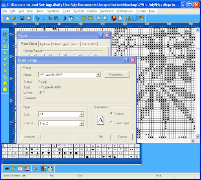
Well, let's just see what these defaults look like when used to print a sample of your chart. First you need to tell the software something about your printer, so click on Setup. Identify your printer from the options and make sure the feed is from the right tray etc. When you are happy you are all set up - and you have your printer switched on, haven't you? - then click OK.
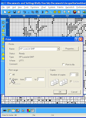
Why waste paper for a trial. Just click on the Print Range option to set up for printing the first page only. Then if you are happy, you can come back and print off the other pages.
We'll look at a few more useful print options tomorrow night.
You will now have a pop up table which is bristling with options. You don't need to understand them all at once to run off a basic print. The software is making some reasonable assumptions and let's just go with those for now. But have a look at the first set of options that are uppemost here. The main choice to be made is the Scale Factor or degree of magnification you require for your chart. Just run through checking on the different circles and as you do that look below at the panel which tells you how many pages you will require for printing at that magnification. When you have done that choose the default Scale Factor 5. Now look at the two panels to the left of the Pages Required Panel. You will see that for Page and Chart there are two values given - these are small square counts - you can think of them as stitch counts if that helps. You will see for the Chart that the square count is 310 x 280 which is slightly more than the stitch count, since there will be a border added around the stitching. This number will not change when you change the Scale Factor, unlike the count for the page which will change. The higher the Scale Factor - the higher the degree of magnification - then the lower the Page counts will be. Try it out for yurself. Then put the Scale Factor back to 5 again. The important thing to point out to you is that there will be no overlaps on your chart pages.
Well, let's just see what these defaults look like when used to print a sample of your chart. First you need to tell the software something about your printer, so click on Setup. Identify your printer from the options and make sure the feed is from the right tray etc. When you are happy you are all set up - and you have your printer switched on, haven't you? - then click OK.
Why waste paper for a trial. Just click on the Print Range option to set up for printing the first page only. Then if you are happy, you can come back and print off the other pages.
We'll look at a few more useful print options tomorrow night.
Thursday 23 September 2010
Going Symbolic!
If you don't have a colour printer and you want to work from a hard copy of your chart, then you will need to convert your chart from coloured blocks to black and white symbols. The way to do this is to go to the top Tool Bar and click on Chart. Now when the menu drops down you will see the B/W Symbols option. Click on this and the moment you do so your chart is magically transformed into black and white symbols ready for you to print off.
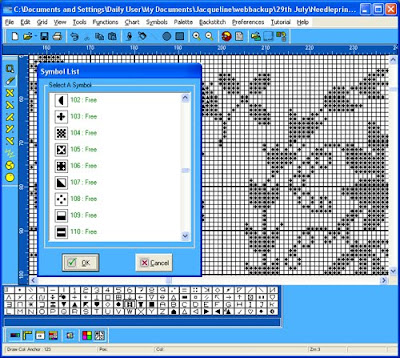
To change any symbol is like changing a colour. You simply double click on the symbol key in the palette and you will be given a menu offering you a choice of symbols - and it kindly tells you which symbols you already have in use on your chart. To change the symbol, double click on a new symbol from the menu and the symbol on the chart will change but the symbol on your palette remains unchanged - how perplexing is that. Hmmm! It is only when you click on another symbol key on your palette that the last change you made is registered. I am a charitable person and try to see the logic in everything. Try as I may, I can see no logic here at all and it is just something like freckles that I have learnt to live with.
The useful thing about the Beatrix Potter chart you have is that there are only two colours - red and ecru and the symbols are set to a dot and a triangle which are easily distinguishable. If you don't like dots and triangles, then you can change - there are 200 symbols in the library. But please, please there are some symbols there that should never, ever see light of day on a chart. Select symbols with clear, clean, simple shapes. Avoid any symbols with more than one dot or three lines - and I never personally use numbers. If you think I have left you with no choice after that, then I will make amends later when I show you how you can make your own custom symbols. But that is after we print out our first chart tomorrow.
Wednesday 22 September 2010
Locating the Centre of Your Chart
In the next few posts we shall be putting together the building blocks which will enable you to print out a useful working copy of your chart. For many of you it was quite a new, and perhaps awkward, experience to have to work from the upper left corner of a chart when commencing your Mary Wigham sampler - many of us are so accustomed to beginning at the centre. But centre lines are useful whether you print out your chart or work from the screen. And in this post we shall concentrate on locating and marking the exact centre of your chart.
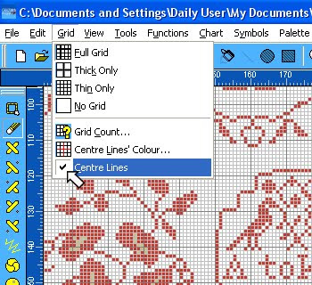
The first step is to check that we have centre lines in place. Look at the top Tool Bar, towards the left, and choose Grid. If you browse this menu you can see that there a number of general grid options to explore - whether to have no grid, a thin grid (with no periodic marking of a defined number of stitches), a thick grid (with only the periodic marking) or a full grid with thin and thick lines marking off defined blocks of stitches - and no, it doesn't have to be blocks of 10, choose Grid Count and you can change to any number to suit your own preference. Play around with these options and see what help they might be to you. Now look at the bottom box labelled Centre Lines (yes, we do spell things funny in the UK if you come from the US, but not if you come from France....or the UK!)Make sure the Centre Lines Box is checked.
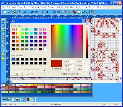
This will give you a cross hair through the centre of your chart. And look up a little and you will see that you can specify the colour of this cross hair to whatever colour on the spectrum will grab your attention best. Choose the colour you prefer.
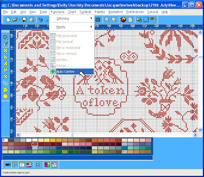
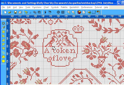
Now we have centre lines on the chart - if you cannot see them, use your Locator Window (which you found in the View menu in an earlier lesson) to home in on them. Now all we have to do is to find the right place on the chart for the lines to intersect so you have marked the centre. Simple! Just begin counting, very carefully, each individual square from the left, ..... OK I'm joking! This time go to the top Tool Bar and chose Functions and the moment you do, out pops a menu and right at the bottom it says Auto Centre. Magic! Click on that and you will see the chart whizz off and do exactly what it says on the Menu.
How easy is that? Isn't it good to be in control?
Monday 20 September 2010
How Would Beatrix Look in Lace
Changing the colour of threads and linens on charts is a bold move and not for the anxious wondering what will be done with all that thread and fabric, not to mention a bruised ego, if it doesn't quite work...nnnnnn. This is where Infinity charting can really help you. Without spending a penny - I'll rephrase that - without any outlay at all, you can try out various colour combinations and mull them over. Every time you change a colour on your chart, save it with a visual clue name like: BP red; BP multi indigo.. here I go again teaching you to suck eggs. We have recently seen some white lace versions of Mary Wigham. Well, how would Beatrix look in lace? Shall we see? The first obvious thing is that if you change the red to white on Beatrix, how on earth do you see it? Well, would you stitch white thread on white linen? Probably not, so we don't have to graph our white stitches on a white background, we can change the background to any shade present on any of the thread palettes. Let's do it now.
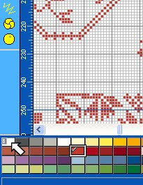
See the B in the first palette colour - that is for Background. Double click on it and hunt around for a background shade that matches some dark linen you already have, or some that you LNS can get for you.
Subscribe to:
Posts (Atom)